

mobile app
ui design
My Role
UI designer
Team
sparklin design team
Shipped
may 2020
About Chaayos


step 1

Analysing the wireframes & collecting references
We analysed the wireframes and started exploring and collecting references to set up a visual language to start the UI design process.
step 2
Sketching and
UI Design iteration
We designed multiple UI iterations for the screens and constantly reviewed and tested it with our peers and stakeholders.
step 3

Polishing and Prototyping
Every UI element was meticulously corrected to ensure a flawless, visually pleasing user experience.
Figma prototyping enabled in making the design tangible, interactive, and easy to comprehend for all stakeholders
step 4

Design handoff
In the final stages of the project, we prepared comprehensive design assets and documentation for the Chaayos development team. This included creating detailed design specifications, comprehensive style guides, and delivering all essential graphic assets
Primary colours
Primary colours were inspired from the Chaayos brand colours to keep it aligned with the brand and also keeping in mind the contrast & sensitivity of the UI
Chaayos Dark Green
#4A8132
White
#FFFFFF
Secondary colours
Secondary colours were inspired from brand colours & primary colours
Chai Yellow
#FAE8BE
Chaayos Light Green
#E7F5EA


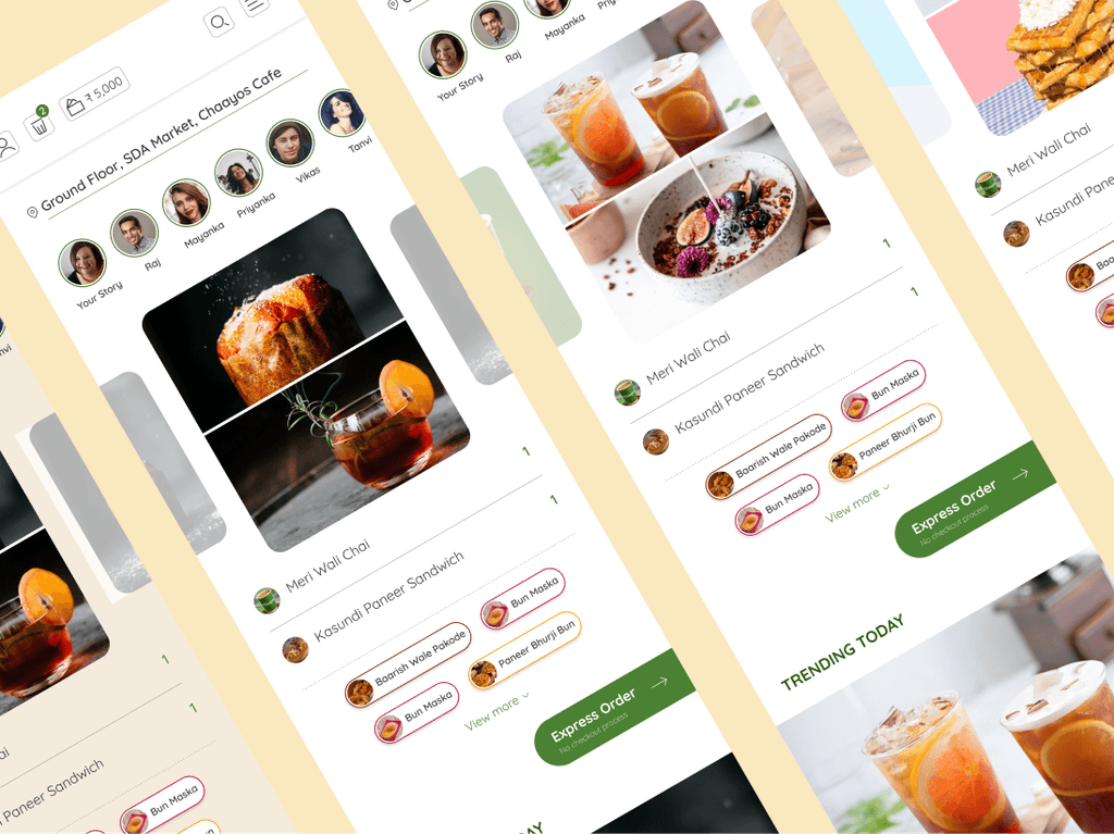
Express Order

Grid View

List View

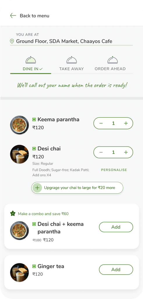
Cart
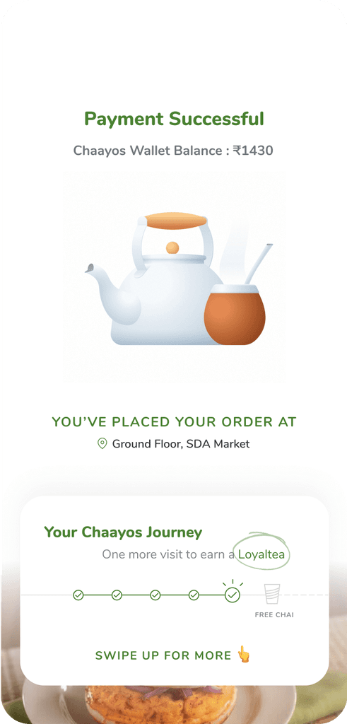
Payment

Success Screen
My Orders

Profile

Offers

Loyaltea Rewards

No Internet Screen

Error Screen