Shifting Speak Magazine

Shifting

Speak Magazine

from print to

from print to digital

from print to digital

digital

Discover how we transformed SPEAK, a platform for multicultural literature and art, from print to digital, using user-centered design to reaching wider audiences, reduce costs, and preserve the essence of traditional magazines in the digital world.

Discover how we transformed SPEAK, a platform for multicultural literature and art, from print to digital, using user-centered design to reaching wider audiences, reduce costs, and preserve the essence of traditional magazines in the digital world.

Project

Project

web

responsive

ux

ux/ui

ui

My Role

UX Designer

Team

Sparklin design team

Shipped

september 2020

About SPEAK

"SPEAK Magazine" is a digital media platform dedicated to multicultural expressions of literature and art. It provides a space for writers and artists from around the world to showcase their work and contribute to a global conversation

"SPEAK Magazine" is a digital media platform dedicated to multicultural expressions of literature and art. It provides a space for writers and artists from around the world to showcase their work and contribute to a global conversation

payment screens:

by SPEAK Magazine

SPEAK Magazine

Problems faced by SPEAK Magazine

Problems faced

Problems faced by

problem 1

COVID-19 pandemic affecting the sale of printed magazines

problem 2

Increased cost of printing an issue of magazine

problem 3

Limited opportunities for the artists and writers to publish their work

Solution

Solution

The proposed solution was to make Speak a digital platform where people can read articles, poems and art online. The user can subscribe to the content online. All the users, whether it be reader, contributor or supporter will find a home in Speak.

The proposed solution was to make Speak a digital platform where people can read articles, poems and art online. The user can subscribe to the content online. All the users, whether it be reader, contributor or supporter will find a home in Speak.

"Clean and minimalistic design"

"Clean and minimalistic design"

After doing a comprehensive competitor analysis and studying data about online reading preferences, we decided our design direction for the website to be anchored in the principles of clean and minimalist web design.

This deliberate style choice prioritises simplicity, generous whitespace, and a sharp focus on core elements. By embracing this approach, we aim to present written content and artwork elegantly while maintaining an uncluttered and engaging user experience. Let's delve further into the rationale behind these choices and their impact on enhancing the platform for it's readers and contributors.

Information architecture

Information architecture

We started by thoroughly understanding the content that Speak Magazine will offer. This includes articles, poems, art, categories, author profiles, issues, contact information, and any other relevant sections. After that we developed a hierarchical structure that outlines the main sections and sub-sections of the website. We started with broad categories and then broke them down into more specific content areas.

We started by thoroughly understanding the content that Speak Magazine will offer. This includes articles, poems, art, categories, author profiles, issues, contact information, and any other relevant sections. After that we developed a hierarchical structure that outlines the main sections and sub-sections of the website. We started with broad categories and then broke them down into more specific content areas.

Grid and layout

Grid and layout

When starting the UI design process, we selected the number for columns the layout will have which impacted the visual flow of content and the overall balance of the page. We went with column layout because its's best for presenting lists of articles or features. We also maintained consistent margins and gutters for the layout which provided visual separation and guides the user's eye. All this while ensuring that the grid and layout are responsive, meaning they will adapt gracefully to various screen sizes and orientations.

When starting the UI design process, we selected the number for columns the layout will have which impacted the visual flow of content and the overall balance of the page. We went with column layout because its's best for presenting lists of articles or features. We also maintained consistent margins and gutters for the layout which provided visual separation and guides the user's eye. All this while ensuring that the grid and layout are responsive, meaning they will adapt gracefully to various screen sizes and orientations.

Colours

Colours

We decided this colour palette to achieve a clean and minimalist web design while still incorporating some visual interest and contrast through the use of the purple and hues of dark grey

We decided this colour palette to achieve a clean and minimalist web design while still incorporating some visual interest and contrast through the use of the purple and hues of dark grey

Primary colours

White is a classic choice for minimalist design. It represents cleanliness, simplicity, and spaciousness. In a minimalist design, the abundant use of white space (or negative space) helps create a sense of elegance and allows the content to breathe.

And the deep dark grey can work well as a background or accent colour in a minimalist design. Darker colours can be used to create a sense of depth and contrast, especially when combined with lighter elements and ample white space.

White

#FFFFFF

Dark Grey 1

#0E1822

Secondary colours

We used bold and vibrant purple colour to be used sparingly to draw attention to specific elements or to add contrast. It can create visual interest without cluttering the overall design.

Shades of grey can be used as neutral colours to provide a visual break from the primary white and black colour.

Bold Purple

#9100D6

Dark Grey 2

#A8A7A6

Dark Grey 3

#C9C9C9

Dark Grey 4

#EEEBF0

Typography

Typography

For typography, we decided to go with the combination of Trirong and Raleway, balancing traditional aesthetics with modern readability, which can contribute to a positive user experience on the website

For typography, we decided to go with the combination of Trirong and Raleway, balancing traditional aesthetics with modern readability, which can contribute to a positive user experience on the website

for titles

Tirong, characterized by thick and thin strokes and its narrow and tall structure, which made it a suitable choice for titles. It's described as having a traditional style, which added a touch of classic elegance to the design. This aligned with our idea of maintaining a "traditional magazine feeling" while transitioning to a digital platform

for body text

We decided to go with Raleway for body text because as an elegant sans-serif typeface, it offers readability and legibility, which are crucial for web content. Its clean and modern appearance complements the minimalist design style. Sans-serif fonts like Raleway are often preferred for digital content because they are easy to read on screens.
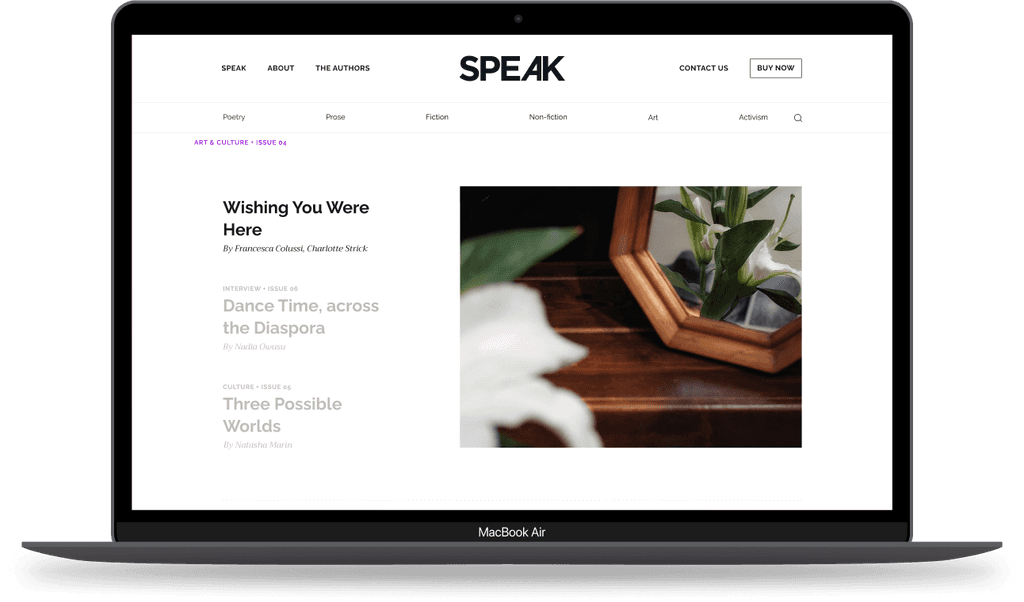
UI elements

UI elements

We focused on creating elements that are not only visually appealing but also user-friendly. We designed flat, minimalist button designs which will not clutter the interface. For iconography, we designed simple and minimalist icons that complement the overall design

We focused on creating elements that are not only visually appealing but also user-friendly. We designed flat, minimalist button designs which will not clutter the interface. For iconography, we designed simple and minimalist icons that complement the overall design

Here are the results

Here are the results

Home page

All authors page

Author details

Cart Payment

Contact us page

Responsive design

Checkout the live product here

Checkout the product

speakthemag.com

Go